
Traffic looks fine. Ad spend is not crazy. The cart is still empty – so you tweak bids, rewrite the ad, chase another keyword. Most of the time the leak sits somewhere duller: the product page never answered the buy questions, or it buried them under “optimizations.” This is a blunt map of what should be on a product page, and of what usually kills conversion instead – no theme rebuild required.
Part 2 of Conversion, page by page – full plan
And it is not a taste problem. In Baymard’s running benchmark of ecommerce product page UX, more than half of the sites tested land at mediocre or poor. The failures are boring ones: shipping cost unknown until checkout, a size nobody can decode, photos that hide the one detail that sells the thing. Shoppers who meant to buy leave because the page made the decision harder than the decision is.
The product page has one job
A PDP answers three questions fast: what is it, what does it cost me, when do I get it. Handle those and the shopper forgives an ugly font. Fumble them and no review widget or brand film saves the session.
Category pages do a different job – orientation above a grid. If that is the mess you are cleaning next, start with ecommerce category page content. This post stays on the PDP: one product, one buy path.
What should be on a product page
Whether you call it a PDP or a product detail page, what should be on a product page is still the buy answers – not another layer of chrome. The floor, in order of how often we find it broken:
- Identity that survives a variant pick. Clear name, honest main photo, and a gallery that swaps when the shopper picks a color. We still find PrestaShop combinations where the image never changes after picking “red” – so the shopper assumes red does not exist. And if the primary photo fails to load at all, the page is done before it started; see fixing PrestaShop images that are not displaying when the gallery itself is the bug.
- A price that matches what brought them in. The ad said €47.90, the PDP says €52.90, because a combination price impact was never checked. That gap reads as bait even when it is just neglect.
- Options a stranger can decode. Size, color, pack – whatever unlocks a real order. Attribute groups labeled “Size1 / Size2”, or supplier codes pasted into dropdowns, are friction wearing an option costume. Jargon on those controls is a UX bug, not a copy quirk – more in product jargon as a UX problem.
- Stock or lead-time truth. In stock, backorder, made to order, ships in X days. An “available” flag that hides a three-week lead time costs you the chargeback later.
- A buy action that works after the pick. Add to cart, reachable without a scavenger hunt – and never silently disabled by an unselected option with no error message.
- One delivery or returns line that changes the decision. Only when it matters for this product: heavy freight, no returns on hygiene, ships from EU. Not a wall of policy links.
- Proof that matches the claim. A real rating summary, a material fact, a compatibility note. Twelve trust logos above the price prove nothing except that you are nervous.
Everything past that list is support. Brand film and storytelling can wait until the buy path works.
What kills conversion
The killers all look professional in a screenshot. On a live session they steal attention from the floor list:
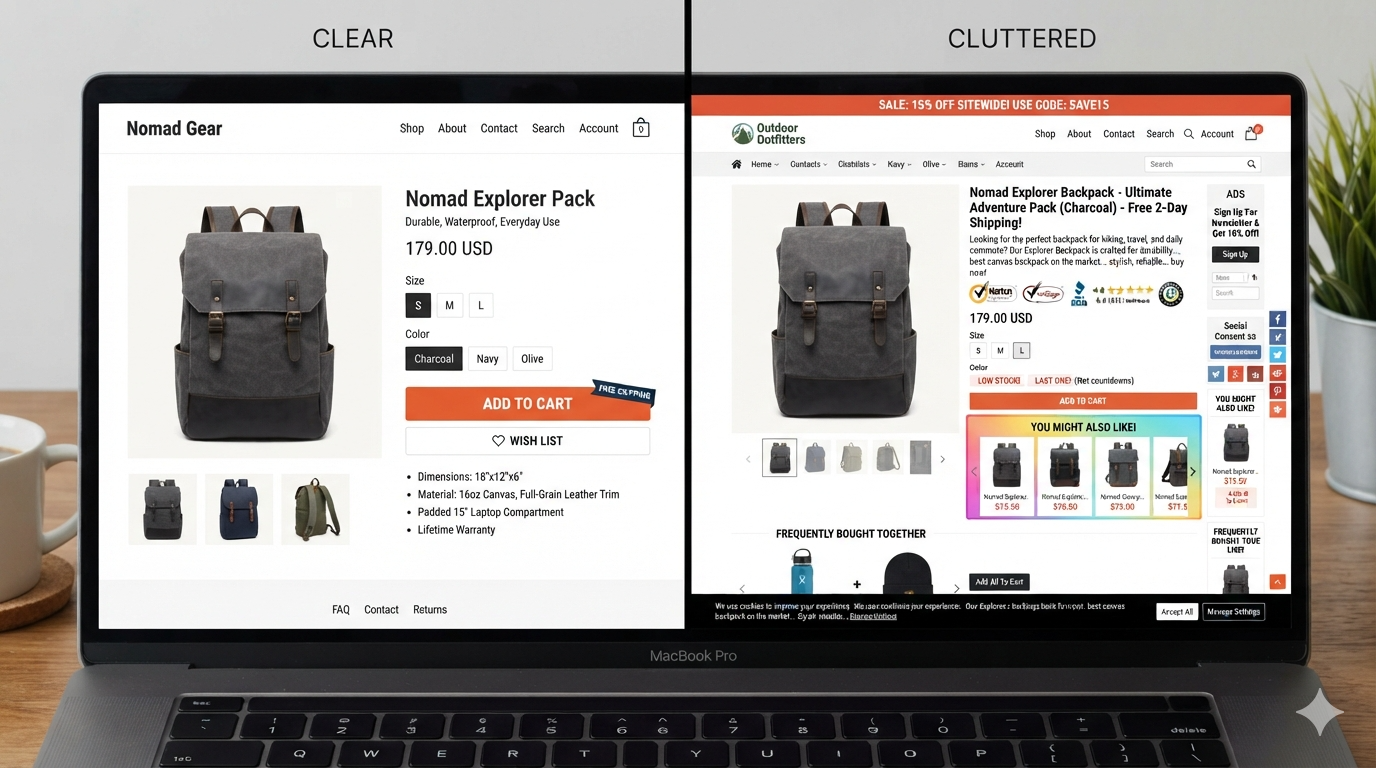
- Promo bar, cookie bar, and newsletter popup stacked before the product is understood – one store we audited had four fixed elements fighting over the buy area
- Trust-badge wallpaper sitting above price and options
- An SEO essay under the title – the same 400 words across 200 SKUs with the product name swapped
- Variants that contradict each other: two size systems on one page, or an option that disables Add to cart with no explanation
- Out of stock with no next step – no notify form, no restock date, no similar item
- Cross-sell carousels fighting the primary buy control for the same eye-level slot
- Fake urgency – a countdown that resets at midnight, or “only 2 left” on a product with 400 in the warehouse
A pattern we keep meeting in audits: sticky Add to cart, size-guide modal, three review apps, countdown timer – while the size dropdown still hides under a tall gallery and the price format differs from the listing card. The page looks optimized on a checklist. It fails the belongs test. A sticky bar is not a hierarchy; if the real controls were never clear, the bar just floats over the mess.
Run a belongs / kills pass on one live product
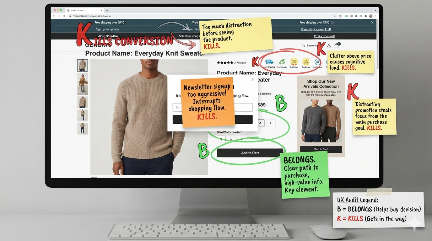
Pick the product that gets traffic and no orders. Open the live storefront in an incognito window, on your phone first – not the back-office preview, the real page with every module injected. Screenshot it. Then mark every block B (belongs – it answers a buy question) or K (kills – noise, delay, contradiction). The question behind every B mark is the title of this post: is this part of what should be on a product page, or is it in the way?
One rule while you work: if a K sits above a B, demote or delete the K first. Do not stack new B content on top of noise. Two removals usually beat one more widget.
- Can you name the product and see it within a couple of seconds?
- Is the price obvious, and does it match the listing or ad that brought the click?
- Can you pick the option you need without guessing the label?
- Does Add to cart work after that pick – or sit disabled with no reason shown?
- What interrupted you before you got those answers?
Put the B/K marks in the ticket. Ship the demotions the same day if you can. The redesign can wait.
Long description, specs, care notes, fit notes, comparisons, FAQs – all of it belongs after the decision path works. It earns its space when it kills a real objection: “will this fit a 2019 mount?”, “can I wash it hot?”, “does it ship to me?” It earns nothing as keyword bulk parked under the title.
If a paragraph exists only for ranking, move the useful facts where shoppers actually look, or cut it. Stuffing the fold with SEO prose is the cleanest way to kill conversion while telling yourself you “did content.”
A note on platforms and languages
PrestaShop, Shopify, WooCommerce – the theme plus the app stack decides what actually renders, and apps love injecting blocks above your price. Audit the live page on a phone-width and a desktop viewport. The back-office fields lie once three modules start writing HTML.
Multilingual stores: translate meaning, not keyword length. A French or Polish title pasted in at twice the English length pushes the buy box down and reads like a spreadsheet. Same for cloned “unique” descriptions that swap only the product name across the catalog.
Mobile is the same problem, cut shorter
The non-negotiables do not change on a phone – identity, price, options, truth, buy. Their order and height do. Promo chrome and tall galleries push Add to cart two scrolls down while a sticky bar pretends the page is fixed. The fold question deserves its own post, and it gets one next. For now, run the B/K pass on desktop and mobile both – and write down which K’s own the first screen on the phone, because that is usually where the order was lost.
Fix the belongs list first. Kill the killers second. The prettier theme comes third, if at all.
This is part 2 of Conversion, page by page.
Previous: Ecommerce Category Page Content: Useful Landing Copy vs Thin SEO Stubs · Next: Your Mobile Product Page Isn’t Optimized – It’s a Desktop Page Shoved Into a Phone