
Shoppers do not abandon carts because your adjectives lack sparkle. They stall when a fabric rating, ingredient name, or compatibility acronym appears with no plain explanation nearby. That stall is a usability failure: product jargon blocks comprehension at the exact moment someone is trying to decide whether a SKU fits them.
Treating unclear terms as a copywriting polish job usually produces prettier sentences that still leave the hard words unexplained. Fixing the UX means putting definitions where hesitation starts – on product pages, in tooltips, and on dedicated term pages that answer the question without sending the buyer to Google to decode your product jargon.
Why product jargon breaks the shopping path
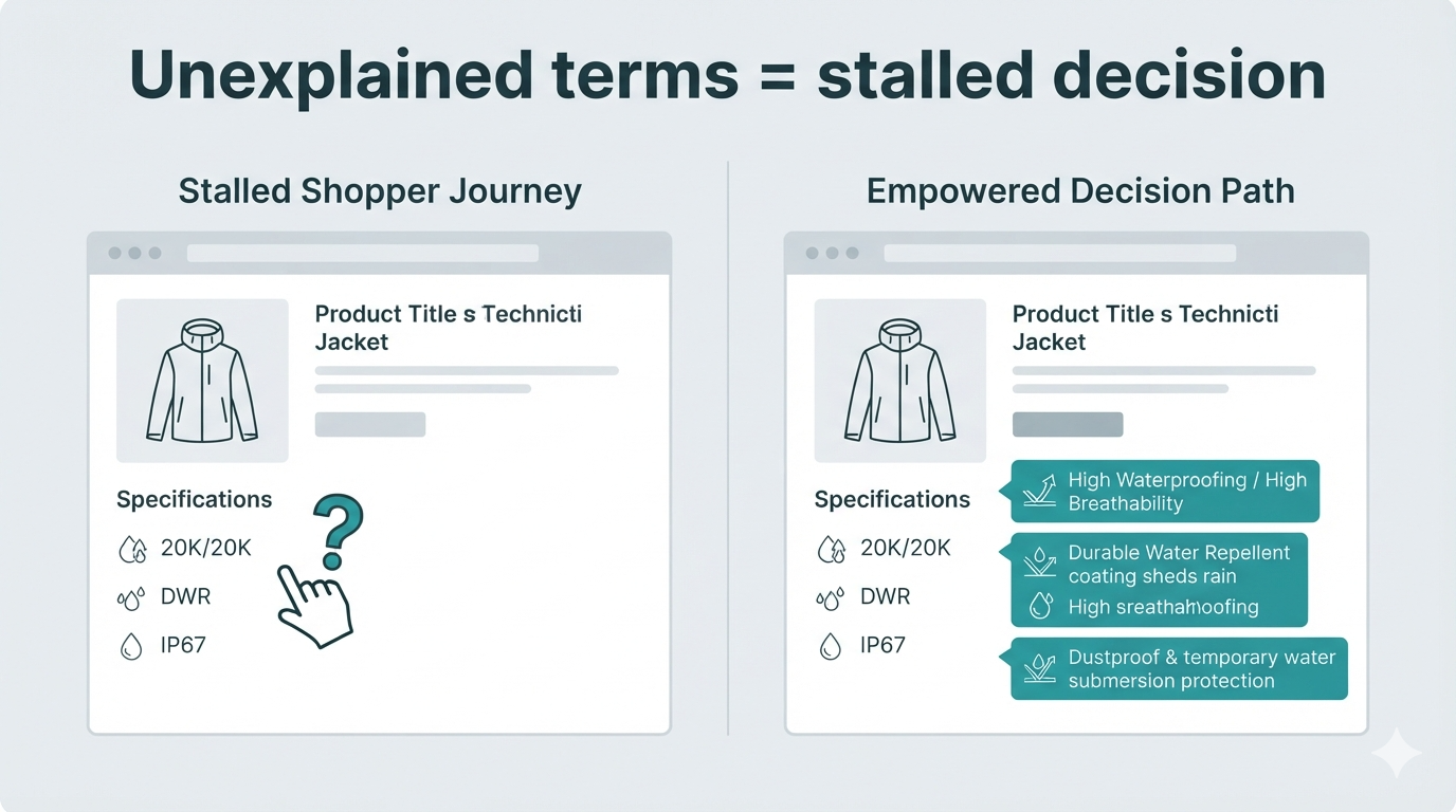
A product page is a decision interface. Specs, materials, and claims are controls the shopper uses to compare options. When those controls are labeled in insider language only, the interface fails the same way a form fails when a field has no helper text: people guess, skip, or leave.
That is different from tone. You can write warm, on-brand copy and still leave “20,000 mm hydrostatic head,” “non-comedogenic,” or “USB-C PD 65W” sitting unexplained in a bullet list. The buyer who does not already know the term has three bad options: open a new tab, ask support, or buy something safer that feels clearer. Each option costs you attention or a sale.
UX research on plain language makes the same point for experts and beginners: clear wording reduces cognitive load and errors. Nielsen Norman Group’s guidance on plain language for experts is useful here – even specialists prefer clear definitions when they are outside their niche, and most retail traffic is not specialist traffic.
Before and after: product jargon that creates hesitation
Here is how product jargon shows up across categories – and what a clearer screen looks like without deleting the technical terms.
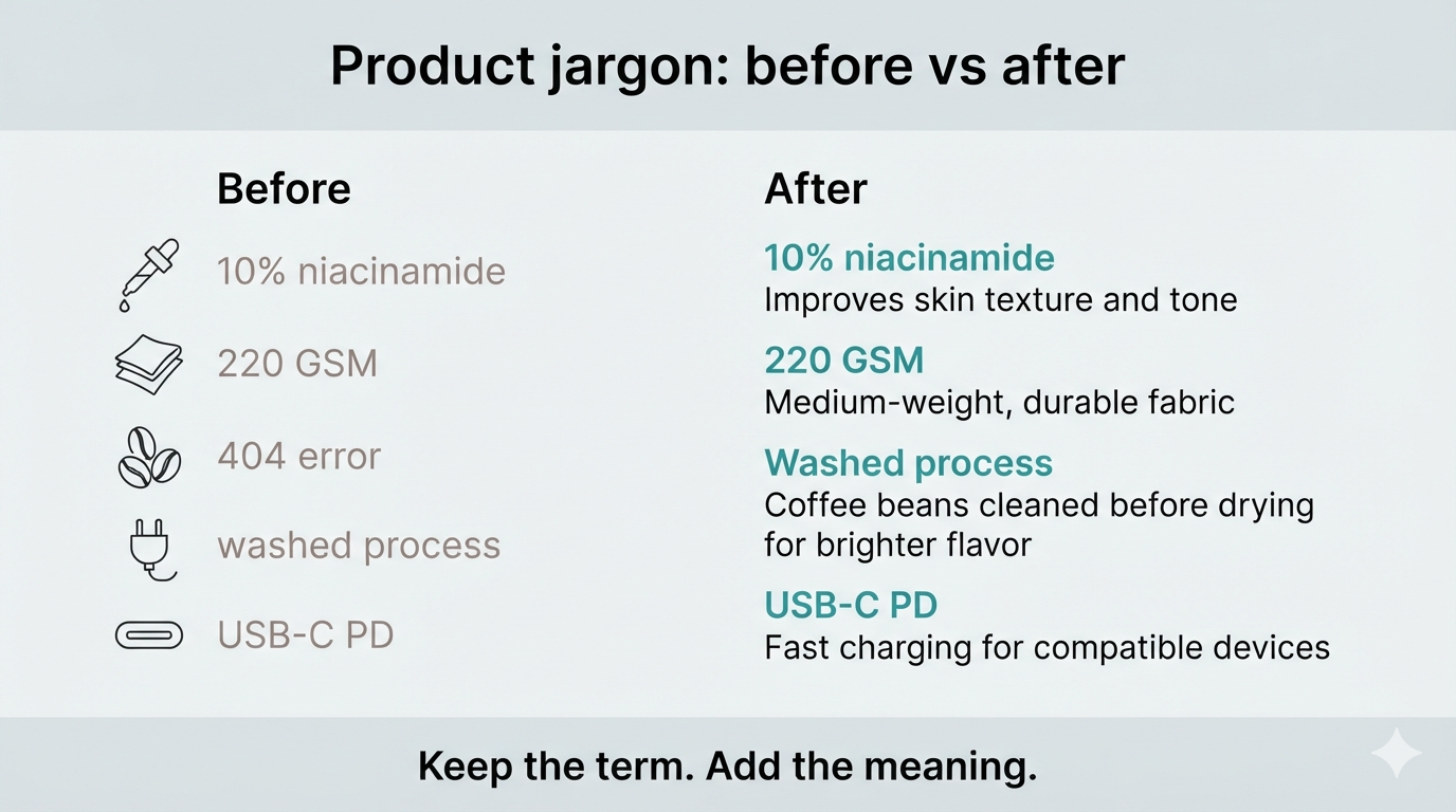
Skincare. Before: “Formulated with 10% niacinamide and ceramides.” After: the same claim, plus a one-line plain definition of niacinamide (vitamin B3 used for uneven tone and oil balance) and what ceramides do for the skin barrier. Shoppers who already know the ingredients skip the helper; shoppers who do not stop bouncing to a search engine.
Fashion. Before: “220 GSM mercerized cotton, garment-dyed.” After: GSM explained as fabric weight (how heavy the tee feels), mercerized as a finish that adds sheen and strength, garment-dyed as dyeing after sewing so color softens with wear. Specs stay; the mental model appears beside them.
Coffee. Before: “Notes of bergamot; washed process; light roast.” After: tasting notes framed as aroma cues, washed process as a fruit-removal method that usually tastes cleaner, light roast as higher acidity and origin character. The menu still sounds like a coffee bar – it just stops assuming everyone trained as a barista.
Outdoor gear. Before: “20K/20K, DWR finish.” After: waterproof rating and breathability in mm and g/m²/24h terms shoppers can compare, plus DWR as a durable water-repellent coating that beads light rain and needs reapplication. Compatibility and care notes belong next to the rating, not in a buried FAQ.
Electronics. Before: “IP67, USB-C PD.” After: IP67 as dust-tight and immersion-resistant to a stated depth/time, USB-C Power Delivery as a charging standard with wattage that must match the device. Compatibility jargon is where returns start when the explanation is missing.
Copywriting polish vs UX explanation
Copywriting asks: does this sound like our brand? UX asks: can a first-time buyer complete the decision with the information on this screen? Both matter. Only one of them fixes unexplained product jargon and orphaned acronyms.
Rewriting “advanced hydrophobic membrane” into “premium weather shield technology” may win an internal style review and still leave the shopper guessing. Keeping the technical term and adding a short definition – what it does, when it matters, what it does not promise – preserves accuracy for experts and access for everyone else. That dual audience pattern is the same idea behind capturing both beginner and expert search queries in your glossary.
If a term needs more than a sentence – examples, comparisons, related products – link to a full entry instead of stuffing the PDP. The structure for those entries is covered in our guide to ecommerce glossary term page anatomy. Short hover text handles the panic moment; the term page handles depth.
Where to put definitions so they actually get used
Place help next to the confusing word, not three scrolls away. Inline tooltips and auto-linked glossary terms work because they meet the shopper mid-scan. A blog post titled “Understanding Our Fabric Specs” helps SEO and education, but it rarely rescues someone who is already on a size chart with a cart open.
Prioritize terms that show up in support tickets, returns, and pre-sale chat. Those are proven hesitation points. A practical way to build that list is the same process we use when merchants choose the first glossary terms for a Shopify store: pull language from PDPs, reviews, and tickets, then score by confusion and purchase relevance.
Keep tooltip microcopy short and concrete. Save longer explanations, caveats, and related SKUs for the term page. Thin one-line dictionary stubs do not solve the UX problem either – they just move emptiness to another URL. How to spot and fix that pattern is in how to avoid thin glossary content.
Apps built for this job keep definitions on the storefront so shoppers never need a new tab. Super Glossary for Shopify supports short tooltip previews on product copy plus fuller term pages with related products – useful when product jargon appears across many SKUs and you do not want to rewrite every description by hand.
When specialist language still belongs on the page
Do not dumb down categories where precision is the product. B2B buyers, hobbyists, and regulated goods often need exact terms. The UX fix for product jargon is translation into plain language beside the term, not deletion of the term. Lead with the shopper-facing meaning, keep the official label visible, and note limits (“not medical advice,” “check device wattage,” “lab methods vary”).
Product jargon stops being a conversion leak when every high-stakes term has a nearby answer. Write for comprehension first; brand voice rides along once the decision path is clear.
Shopify App
Ready to turn your store's terminology into an SEO asset? Try Super Glossary for Shopify to automatically link technical terms and add helpful tooltips to your product pages today.