

Open live checkout on a phone. Count every field that is not needed to ship or charge. If paid orders die after the cart, that count is usually why – the more confusing the checkout form, the fewer buyers finish.
Part 5 of Conversion, page by page – full plan
The last spoke was the cart page confirming the bag. This page takes the money. Address, shipping method, pay. A form that also asks how they heard about you, wants a second phone “for evenings,” and hides guest under Create account is not thorough. It is how you talk people out of an order the cart already won.
What a checkout form has to do
One job: take payment and a ship-to. Who gets the parcel. Where it goes. How it ships. How they pay. Then a Pay button they can actually find.
The cart already showed the lines and the total. This checkout form does not need to re-pitch the product, collect a marketing survey, or force a password before the card. If a field is not required to ship the order or charge the card, it does not belong on this screen.
What makes a checkout form confusing
The longest one we have untangled this year was a clothing shop on a default theme – nothing custom, nothing wild. Create account before the card. Email, then email again. Password, then confirm password. Company. VAT. Fax, still sitting there from 2012. Two phone fields, one labeled “evening.” A dropdown: how did you hear about us. Newsletter pre-ticked. A progress bar that said Step 3 of 5 and gave no hint what 4 and 5 were. The total sat as a tiny line under a coupon widget. Pay lived below the fold, named “Continue,” so nobody could tell the click charged them.
None of that is exotic. Most confusing checkouts are ordinary extras stacked one at a time – each one defensible, the pile fatal.
The cleanest guest form we have shipped asks for a shipping address, a method they can read, payment, one Pay. Guest is the default. Account is an offer after the charge, if they want order history. Same job as the long form. One of them takes the money.
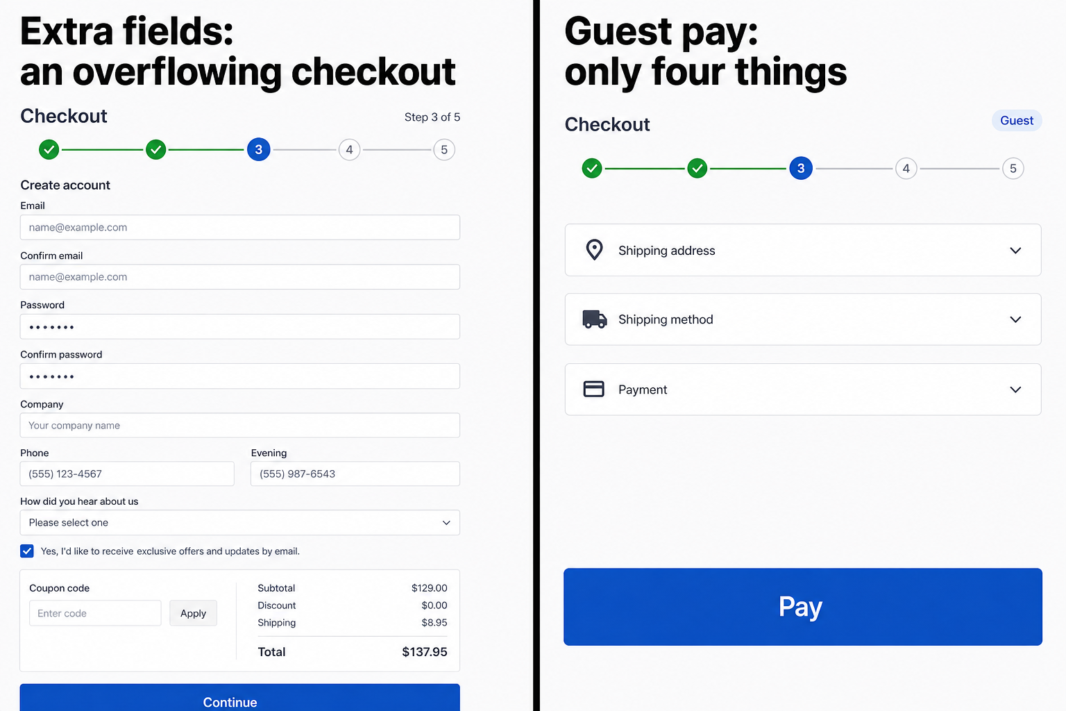
Fields that can wait until after pay
Nick Babich’s Smashing Magazine piece on mobile forms puts the rule in one line: every field is effort, and shorter is better. Extra questions at signup or pay are how you lose a person you already had. Follow up later if you need the story. Do not hold the card hostage for it.
Cut or move off this screen:
- How did you hear about us
- Newsletter signup (ask after Pay, unticked)
- Company and VAT unless the shopper chose business checkout
- Fax
- A second phone
- Account password, if guest can pay
- Date of birth, “favorite color,” anything that feeds a CRM and not a shipping label
Required for a legal invoice or a customs form is not “nice to have.” Keep those. The test is still the same: does this field ship the parcel or charge the card. If the answer is no, it can wait.
Guest checkout vs an account wall
Forcing a login to pay is two forms doing the job of one. They already typed an email in the cart, or they are about to type one for the receipt. Asking for a password before the card is a membership desk between “yes” and the money.
Guest first. Show Create account after the charge, when the order exists and a history is worth having. If they already have an account, sign-in is a shortcut – not the only door. Burying guest as a tiny link under a tall login box is the same wall with worse manners.
When the form wipes what they already typed
A failed Pay that blanks the form is enough to lose the order. The buyer fills the address, types the card, hits Pay. Something fails – CVV, a required tick, a postcode the carrier does not like. The page reloads. The card number is gone. Sometimes the address too. Most people do not start over. They leave.
Keep what they typed. Mark the one field that broke. Do not clear the card because a newsletter checkbox was empty. PCI does not require you to punish people; it requires you not to store the PAN. A reload that blanks the form is a shop bug, not a security feature.
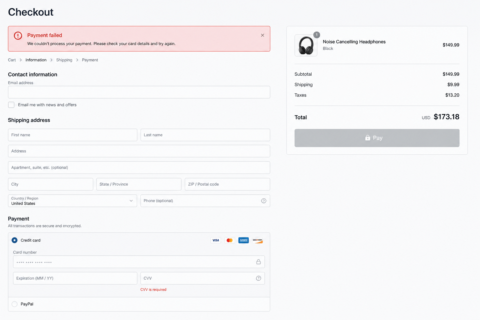
The same form on a phone
You already fought the desktop dump on the mobile product page. Checkout is where that fight is easier to lose: every extra field is a full-width keyboard and a zoomed input, and five “steps” that felt tidy on a 27-inch monitor are five separate visits on a bus.
Full-width fields. Labels above the box, not beside it. The number keyboard for the card. One column. Pay visible without a scavenger hunt. If you need a second screen, make it “card details” – not “tell us how you found us.”
Open the live form tonight and count again. Cut what does not ship or charge. The cart already won this order once – the only job left is not losing it at the form. Then try to pay on a phone with one thumb. If you stall, they stall.
Work this with your AI agent
Do not ask an agent to “improve checkout UX.” Feed it the actual form and make it sort ship-or-charge from can-wait.
What to paste: the checkout HTML, or two screenshots (desktop + phone). If your first screen is guest vs account, paste that too – plus the error state, the screen a buyer sees after a failed charge.
Prompt 1 – field inventory. “List every field and step on this checkout. Tag each one: needed to ship or charge, or can wait until after pay. Propose a cut list. Do not add features. Do not invent Express Pay as the fix.”
Prompt 2 – guest path. “Here is the first checkout screen. Rewrite it so a guest can pay without creating a password. Account becomes an offer after the charge.”
Prompt 3 – the wipe test. “Here is the error state after a failed payment. List everything the form cleared. Rewrite the flow so a failed charge keeps every field the buyer already typed.”
Good output: a field inventory, a shorter order of blocks, and an error state that keeps what they typed – something you can hand to a theme. Not “improve the flow.”
This is part 5 of Conversion, page by page.
Previous: Cart Page Confirms the Order – It Doesn’t Re-Sell It · Next: Thank-you / post-purchase – still writing. Subscribe on the series hub so you do not miss it.