
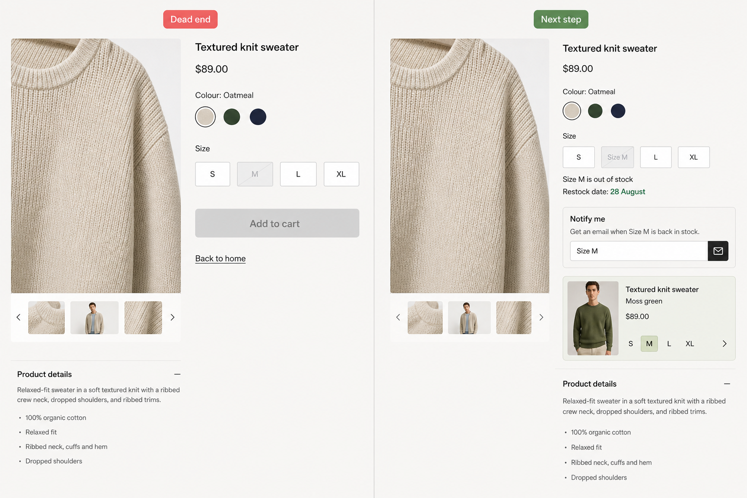
What belongs on an out of stock page? The next step – notify for that size, a substitute in the buy slot, or the date they can order. A grey Add to cart and a Back to home link is not a next step. It is how you end the visit.
Temporary gaps happen – a size gone until Tuesday, a carton late, a colour due on the 28th. Baymard’s out-of-stock research is blunt on the waitlist-only trick: an “email me” button is a weak next step compared with letting people order with a later dispatch when you can actually keep that promise. If you cannot take the order, the purchase area still needs that next sentence – not a homepage dump.
Temporary out of stock is not discontinued
Coming back and gone for good are different pages. A waitlist on a killed model is false hope. A 404 on a restock is how you throw away the person who bookmarked the URL. This post is the coming-back case. When the SKU is dead, that is a different job – successor, parent category, or an honest removal – not Home as a mop. We will cover that kill path in the companion article; do not mix the two in one template.
What an out of stock page has to show
Status belongs in the purchase area, where Add to cart used to be. Not a grey button with no sentence. Not a tiny note under a long description. Which variant is empty (Size M, Blue). What happens next. A disabled control with no words is not honesty. It is a shrug.
You already owed a stock or lead-time line on the live product if you followed what should be on a product page. When that line becomes “none now,” the same area has to switch job. Keep identity, price, and the options they can still buy. Replace the dead primary action with the next action you can keep.
Notify, substitute, or name the date
Pick the strongest next step the warehouse can actually run. Do not wallpaper all three on top of a grey button.
- Notify for that variant. “Email me” with no size is how you spam someone when 42 is back and they wanted M. Confirm the variant in the form. One mail when it returns, not a drip.
- Substitute that can ship now – an alternative, not an add-on carousel. Same use, similar price. Put it in the buy slot, not a “you may also like” row under reviews.
- Name the date if they can still order: restock day, or a longer dispatch you will hit. “As soon as possible” is how you train the next ticket.
If ops can take the order with a later ship date, that is often stronger than a waitlist. Baymard keeps finding sites that only offer the email button. The shopper who is not dead-set on this exact SKU still needs a substitute beside it. The shopper who will wait needs a date they can believe.
That date is a promise. If it later slips and the shop stays quiet, you already know what happens: they ask where is my order. Do not print 28 August on the out of stock page if the warehouse cannot say 28 August.
Why email me alone is a weak next step
A notify field is easy to bolt on. It does not create a commitment the way an order does. People forget they signed up. The mail lands when they already bought elsewhere. Use notify when you truly cannot sell the gap – and put a substitute or a date next to it so the visit still has a path.
Midnight “available” that is really a three-week wait is the same bug in a green badge. If they can order, say the dispatch. If they cannot, stop pretending the button works.
When the page jumps to another size
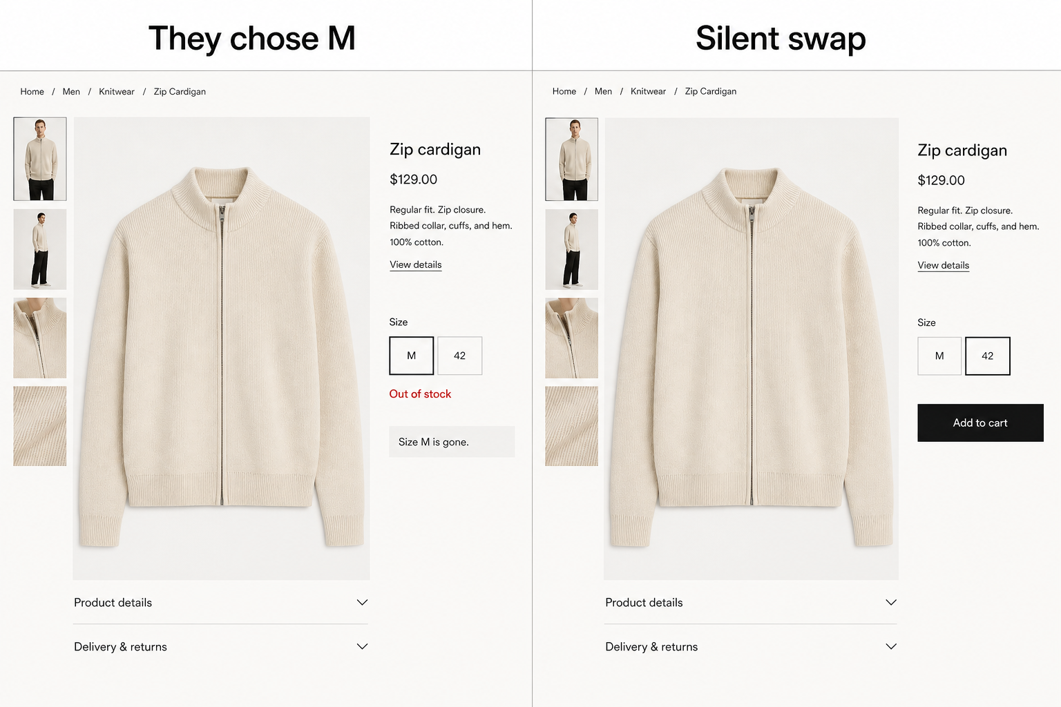
They clicked M. The theme lands them on 42 with a live Add to cart and no sentence that M is gone. That is not an out of stock page. It is a silent swap – and a return when the box arrives. Leave M visible and empty. Put notify or a date on that size. 42 stays buyable when they pick 42, not because the page hid the gap.
Keep the URL live while it is coming back
Keep the product page live, and show that it is out of stock. Hiding it from the catalog, taking it offline for a two-week gap, or sending that URL to Home throws away the person who saved the link and the search listing you already paid for. Substitutes can live in the buy slot and, if they need a grid, on a real category landing – not on the homepage hero.
When the product is gone for good, stop using this template. A killed SKU needs a successor, the parent category, or a clean removal – not a waitlist and not a homepage redirect. That is the other article in this pair.
Open one live product that is empty today. If the only next click is Home, you did not tell the truth. You ended the visit.