

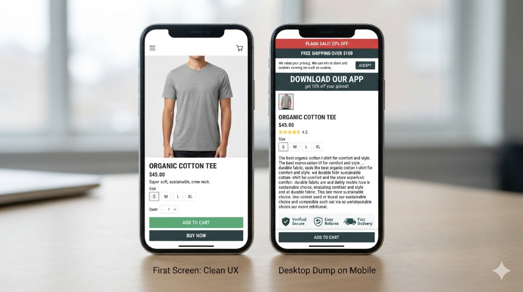
The theme is “mobile friendly.” PageSpeed is green. Somebody even added a sticky Add to cart. And yet the phone session still dies halfway down a wall of desktop leftovers – promo strip, cookie banner, trust logos, an SEO paragraph, then a tiny product photo. That is not a mobile product page. That is a desktop layout shoved into a narrow screen and sold as optimization.
Part 3 of Conversion, page by page – full plan
Google already indexes and ranks primarily from the mobile version of your pages. If the buy path only works on a wide monitor, you are not “almost there” – you are measuring the wrong screen. The companion map of what should be on a product page covers the full belongs list; this post is about the order those blocks land in when the screen is 390 pixels wide.
A mobile product page is a stacking problem, not a styling problem.
“Mobile optimized” usually means the desktop page still runs the show
Responsive CSS makes columns stack. It does not decide what deserves the first thumb-scroll. Themes keep the desktop module order. Apps keep injecting where they always injected. Nobody re-sequenced anything – the phone only squeezes the same sequence until Add to cart sits under three non-buy blocks.
The tell is boring and repeatable. Open the live product on your own phone – not the back-office preview, the real URL with every module loaded. If you scroll past chrome before you can name the product, read the price that matched the ad, or tap Add to cart, the layout is still desktop-first. Speed scores will not fix the order.
What a mobile product page must do in the first screen
A mobile product page has one job in the first screen: let someone decide and act. Not “feel branded.” Not “see every trust signal.” Decide and act.
On that first screen, protect only what unlocks the purchase:
- Identity. Name and a clear main image – big enough that the thing is obvious without pinch-zoom.
- Price that matches the click. If the ad or listing said €47.90, the first screen cannot hide a different number behind a closed accordion.
- Buy-critical options. Size, color, pack – whatever must be chosen before Add to cart works. Labels a stranger can decode; supplier codes and “Size1 / Size2” burn scarce space and taps. That is the same product jargon UX problem, only louder on a phone.
- A reachable primary buy action. Real Add to cart (or Buy), not a decorative sticky that covers the working button and does nothing useful.
- One honest stock or delivery cue when it changes the decision – ships in 2 days, made to order, heavy freight. Not a policy novel.
Everything else waits below. Reviews, long description, related products, brand story – useful later, fatal when they push the buy controls off the first screen.
The desktop dump: what usually steals the first screen
We keep seeing the same stack on live phones. On one catalog we audited, five fixed strips sat above the product name – and two of them said the same thing. The usual suspects:
- Chrome before the product. Promo bar + announcement + cookie notice + “download our app” – four strips before the image even loads. The shopper came for a product, not a billboard.
- Trust wallpaper above understanding. A row of payment and security logos before price or photo. Nervous chrome does not replace a clear product.
- SEO essay under the title. Two hundred words of keyword-rich intro copied from the desktop template, so price and options start below the fold on every phone. That text was written for Google, not for the person holding the phone – and Google reads it fine from below the fold.
- Cross-sell before Add to cart. “You may also like” carousels fighting for the thumb zone while the primary SKU still has no size picked.
- Gallery that eats the viewport. Huge thumbs or a slider that needs three swipes before price appears – fine on desktop, rude on a phone.
- Sticky UI that lies. A floating bar that covers the real Add to cart, or a sticky ATC that is disabled with no error because an option is empty. The preview looked clean; the live page with modules did not.
None of that needs a redesign budget. It needs someone to admit the desktop order survived the “mobile project.”
Reorder before you rebuild
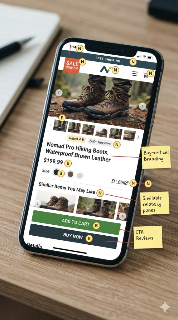
Pick the mobile product page that gets traffic and soft conversion. Open it on a real phone. Screenshot the first screen. Then write every visible block top to bottom – bars, image, title, price, modules, buttons. Mark each block buy-critical or noise.
If noise sits above buy-critical, move it or delete it. Theme positions and module hooks first: in PrestaShop that is hook order on the product page, in Shopify the section order in the theme editor, in WooCommerce whatever the page builder stacked. Do not buy another “mobile UX” app until the existing stack is honest. A redesign that keeps the same module order just redraws the dump.
Category pages have a different job – orientation above a grid – so do not steal fixes from there; if the listing page is the mess, start with ecommerce category page content. This audit stays on one product URL.
After Add to cart: what still earns space
Once the buy path is intact, the rest of the page can earn its keep: specs, care, fit, FAQs that kill a real objection, comparison to sibling SKUs. On a mobile product page those blocks must sit after the decision path – not interrupt it. Same rule as the full PDP map from the companion post, cut for a thumb-sized screen.
Platform notes without a CMS sermon
PrestaShop, Shopify, WooCommerce – same failure mode. The back-office preview is not the live storefront. Apps and modules inject late: cookie tools, upsells, chat, notification bars. Audit on a real phone after a hard refresh, logged out – on the mid-range Android your customers actually carry, not a flagship on office Wi-Fi.
Multilingual stores get an extra wound. FR/DE/PL titles and short descriptions often run longer than the English draft. On desktop you shrug. On a mobile product page, the longer string pushes price and Add to cart down another half screen. Translate meaning, then cut length for the phone – do not only translate.
If the answers are missing, fix that first
Reordering will not save a page that never answers what it is, what it costs, or when it arrives. Fix those buy answers on the full product page first. If they exist and the phone still buries them under desktop leftovers, your mobile product page does not need another optimization badge – it needs a shorter stack.
This is part 3 of Conversion, page by page.
Previous: What Belongs on a Product Page (and What Kills Conversion) · Next: Cart Page Confirms the Order – It Doesn’t Re-Sell It