
Had a hair dryer, mixer, or drill that ran for years, and now it is time to replace it? You look up the model. Every shop stamps discontinued – or just “out of stock” – and stops. No next model. No “this line is over.” A five-minute repurchase becomes an evening of hunting leftovers and other brands. A discontinued product page that names the next model (usually a small refresh, a new letter on the SKU) would have closed that order. Your shop can do the same.
Last week’s piece was the other job: an out of stock page when the SKU is coming back. Notify, a substitute, or a date. This one is gone for good. Do not mix the templates. A waitlist on a killed model is false hope. A 404 on a restock is how you throw away the bookmark.
Discontinued is not out of stock
Coming back and gone for good look similar in the back office – both show a dead Add to cart – and that is how shops copy the same grey button onto both. They are not the same visit. Temporary empty: keep the page, say when it returns. Killed: the shopper still landed on a URL they typed or saved. They need the next model, or a plain sentence that this line is finished.
What a discontinued product page has to show
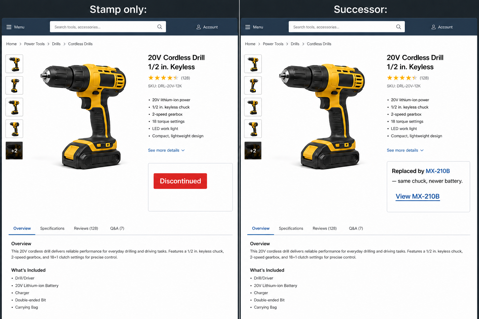
Open a killed SKU on most catalogs and the purchase area is a word. Discontinued. Sometimes a red badge in the same place as “in stock.” No why. No what now. No link. The person who came to buy the thing they already trust has to guess: is there a replacement, or is this the end of the line?
They guess “end.” Then they search the whole web for leftover stock, or they start over with another brand. You had the order if you had named the next SKU in that same slot.
Most killed SKUs are a letter change
Factories do not kill a popular drill and leave a hole. They ship MX-200, then MX-210, then MX-210B. Same grip, slightly better battery, a new letter on the carton. Inside the catalog that is a new product. On the old URL it reads as a funeral.
The shopper does not know your article scheme. They know the tool that lasted ten years. If the page does not say “this is the one that replaced it,” they will not invent that sentence for you. They will assume the line is dead and leave.
Put the successor where Add to cart was
Keep the old page’s identity: name, photos, specs people still search. You already owed that on a live product if you followed what should be on a product page. Swap the dead button for a link to the next model’s own page – name it, say what changed, send them there. Do not put Add to cart for MX-210B on the MX-200 card. That is a silent swap, and they will think they bought the old tool. Not a “you may also like” row under reviews. The buy slot is where they looked.
One successor. The closest twin, not a carousel of cousins. If you have three “similar” items and none is the refresh, you do not have a successor. Say the line is over and send them to the parent grid – a real category landing, not the homepage hero.
When the line is actually over
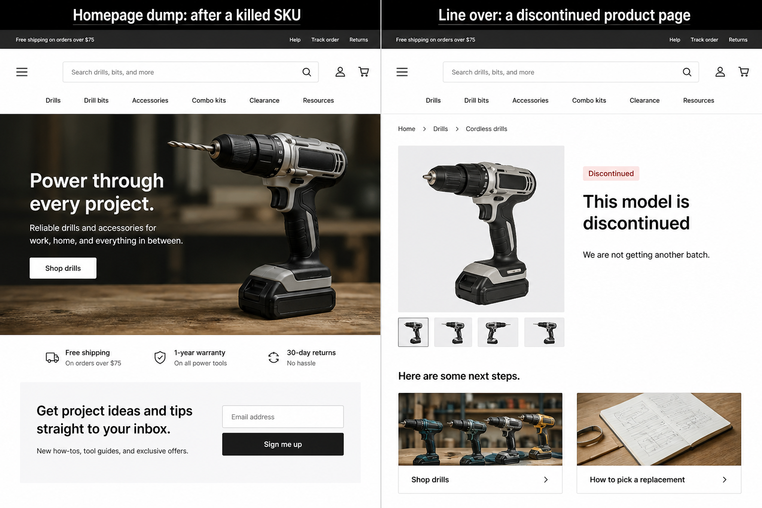
Sometimes there is no next letter. The range ended. Then write that. “This model is discontinued. We are not getting another batch. Here is the category if you still need this job done.” That is an honest dead end with a door. Notify me on a SKU you will never stock is a lie you will pay for in mail and tickets.
This is also a good place for a post from your blog – how this tool was used, how to pick a replacement in the same job, which analog still fits the old stand or chuck. The product page still has the people who typed the old name. The post still has the advice. A stamp and a homepage link gives them neither.
If the URL still has demand – people search the old name, other sites still link it – keep the page live at 200 with that sentence and the next click. A thin badge and nothing else is not a tombstone. It is an empty room.
Why homepage redirects fail
The other popular mop is a 301 of every killed SKU to Home. The shopper asked for a drill and got a hero banner and a newsletter field. That is not a discontinued product page. It is how you teach them the old URL never meant anything.
Search can read an irrelevant redirect as a soft 404, so the “keep the SEO” trick keeps nothing. Patrick Stox on discontinued product pages is blunt on the order: a genuine replacement gets the 301; no twin but the URL earned links or traffic – the closest relevant page (almost always the parent category, not Home); nothing worth saving – 404 or 410, which is not a ranking penalty. Do not invent a clock for how fast Google drops a URL. Make the destination match the query.
A short decision order
- Coming back? Use the out of stock template – not this one.
- There is a real successor (often a letter on the SKU)? Name it in the buy slot. 301 the old URL there only if it is actually the same product, next version.
- Line is over, but the URL still gets people? Keep a live discontinued page: one honest sentence plus the parent category.
- No successor, no traffic, no links worth saving? 404 or 410. Do not force a 301.
- Homepage is not a row on that list.
Pick one killed SKU you still rank for. If the only next click is Home, or the only word is Discontinued, you did not finish the page. You sent a loyal buyer to another brand.